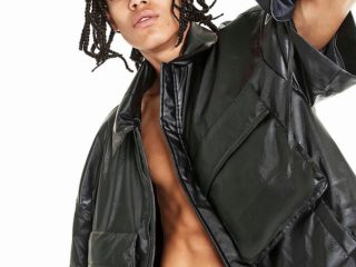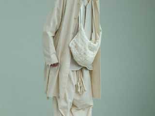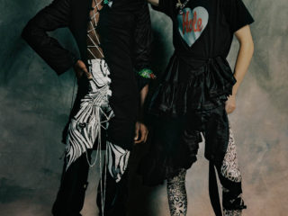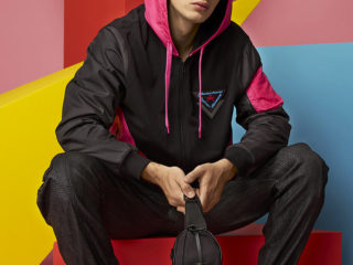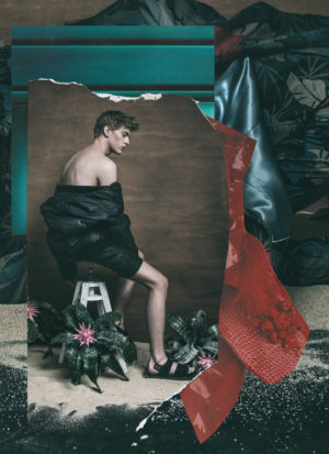

A feel so ultramodern is the first thing that may cross one’s mind when observing this line and campaign. Though, what is actually presented in the VIVACITA 2012 A/W Lookbook is the importance to detail, polish and modification. When broken down VIVA epitomizes the word cheer while CITTA is equivalent to the term city. Now mixing these two lively expressions together does create quite the explosion.
The 2012 A/W Campaign is the vision of Chia Jen Chang who’s degree in Industrial Design elevates his thoughts and views on the symmetry of style. Crafty and sprinkled with patterns Chia found a balance between the industrial world and the world of clothing. Strongly believing that fashion is means of communication and self expression the new line’s lookbook screams uniqueness with a sense of faint, mysterious and unearthly ways. It is evidently an outburst of technique, gambles and a combination of subtlety and strength. Dim hues and darken shades VIVACITA 2012 A/W Lookbook is equivalent to an up-to-the-minute take on loud simplicity.